I want to apologize publicly to all the strangers I have run into on the street while texting someone, emailing someone, or not paying attention to traffic lights, where I was going, or really anything that isn’t my phone. It’s a problem I have: I’m a multi-tasker, for lack of a prettier word. I am a sucker for appliances with several uses—it chops and it dices! I like combination exercise classes—it’s yoga and it’s rock climbing! When I cook, I often try to do too many things at once, which leads to pots of water boiling before I think they will and me dropping whatever it was I was chopping or mixing or pouring. It all gets done. Just by juggling.
I was emailing someone on my way to the subway the other day when I ran into a perfectly nice person exiting the gym near the downtown entrance, Crunch or Boom or whatever. He looked at me at first with irritation, and then those endorphins must have kicked in because he apologized to me, even though it was very much my fault, and I apologized to him, rightfully so, and I returned to my email only to realize that I had lost track of what I was saying entirely. So I put my phone away, and I walked with my gaze not down but forward, and I happened to see the movie being advertised above the downtown 6 entrance on 33rd street. It was and perhaps still is What Maisie Knew, which is a Henry James novel I have not read but imagine to be nothing like the film, or at the very least its poster. Because its poster looks like this:
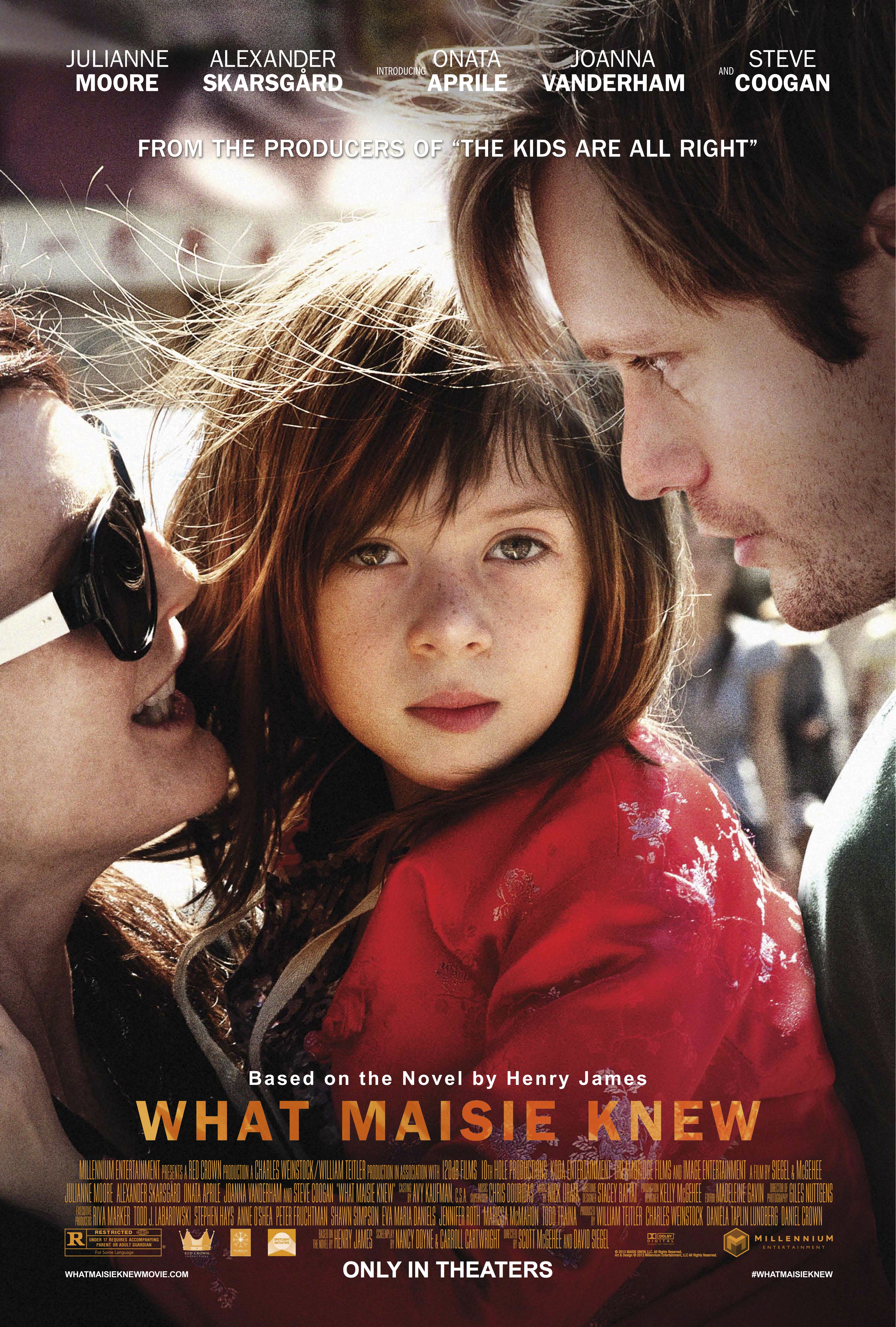
There are many questionable stylistic choices on display here. For one thing, as someone in that very desirable demographic of people who would be interested in either a Henry James film adaptation or anything with Steve Coogan, I can tell you that his absence from the poster, even when replaced with Alexander Skarsgård’s pretty face, is, uh, noticeable. But I think the worst aspect of this poster is the visual implication that Maisie might be psychic. The lighting has a very SyFy network feel to it; there is something supernatural in our midst; she seems anointed by some far away light. Who decided this was okay? I wondered as I descended into the subway.
Actually, the worst part of this poster is not its content, but the very real likelihood of its ubiquity, particularly on the covers of new editions of the novel, issued to capitalize on whatever success the film might enjoy. Most likely this is an anxiety that will be relegated to the past. Does it matter if Scott Rudin has optioned the book on your iPad or your Kindle Fire? But for those of us who either refuse e-readers or dabble in a combination of the available technologies, it still feels like a universal pain. We’ve all had, I think, that one terrible copy of a classic book, sullied by the appearance of Gwyneth Paltrow in an empire-waisted dress. I can think of several books I thought to buy before the movie came out, only because I didn’t want an actor’s glossy face looking at me whenever I put the book down. We Need to Talk About Kevin, for instance, has a cover that is only marginally better than a film tie-in would be, but that margin is considerable. Revolutionary Road isn’t a favorite, but I don’t think I could have handled seeing Kate Winslet’s beautiful blonde hair whenever I pulled the novel out of my bag in the subway. I remember reading Possession with Gwyneth Paltrow’s smirk on the cover (again with this woman) and High Fidelity with a gormless John Cusack mugging at something off camera. Worse though are the hypothetical dodged bullets. How awful it must be to read Charlie and the Chocolate Factory with Johnny Depp’s face decimating any child’s independent ideas of what Willy Wonka might look like.
This is the pretty obvious point, isn’t it? When you read, you come up with your own version of the author’s images. Seeing your version ruled out feels like you’re losing something. Your Daisy Buchanan has blonde hair that doesn’t curl like Mia Farrow’s. It doesn’t look slick over her ears like Carey Mulligan’s hair does. You’re not thinking of what would look good on film when you’re reading these novels. You’re not thinking of Brooks Brothers marketing when Daisy cries over clean shirts.
I remember a story a costume designer told me about how she had to dye a blouse on set. She was told last minute that the director preferred everything white to be tinted, and this was the way he wanted to achieve that effect. She had gone through a lot of trouble to find this shirt. It was silk and cut in a specific, hard-to-find way that the script had called for. Now she had to change its appearance dramatically. In the wrong hands (mine, I imagine), that shirt would be destroyed by the rushed dye job, but she was a professional. The only hitch was that she hadn’t dried it entirely, so the film’s star had to wear a slightly damp blouse, which she of course complained about incessantly.
The complaining was the point of the gossip, but I think about this story sometimes when I’m watching a movie and I notice something small like the color of someone’s pants. It’s so difficult to get everything right with a film. There are thousands of decisions to be made. People always end up scrambling on set, juggling their tasks. By choosing material that already has an audience, a studio is already failing at something. Something’s always lost when a book is adapted for the screen, and it could be as unnoticeable as the color of a shirt. Or it could be enormous. I mean, all sympathy aside: that poster is just atrocious.
Follow Vol. 1 Brooklyn on Twitter, Facebook, Google +, our Tumblr, and sign up for our mailing list.